Ask the Tech Guru
an AARP MEMBER’S ONLY COLUMN
An article series focusing on answering the tech questions of a 50+ audience.
Stryker
SALES COLLATERAL
A collection of emails, flyers, advertisements, icons, and illustrations created for Stryker’s North American sales team.
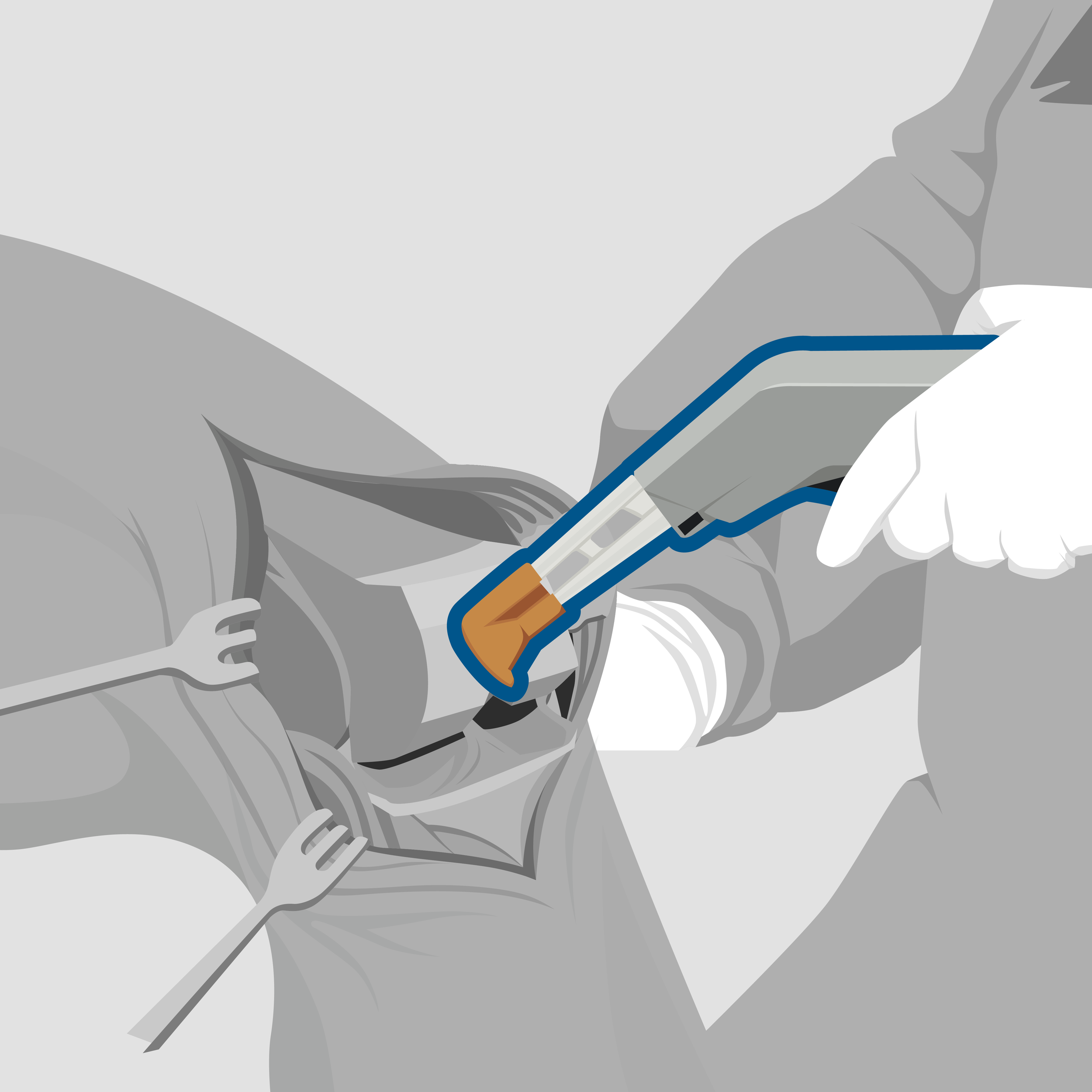
Mockup email inviting nurses to visit a tradeshow booth
Product icons created for internal use, such as in the sales email above
The original layout sketch, drawn in Procreate.
Layout sketch with products mocked up.
The final basic illustration, flat vector shapes created in Illustrator.
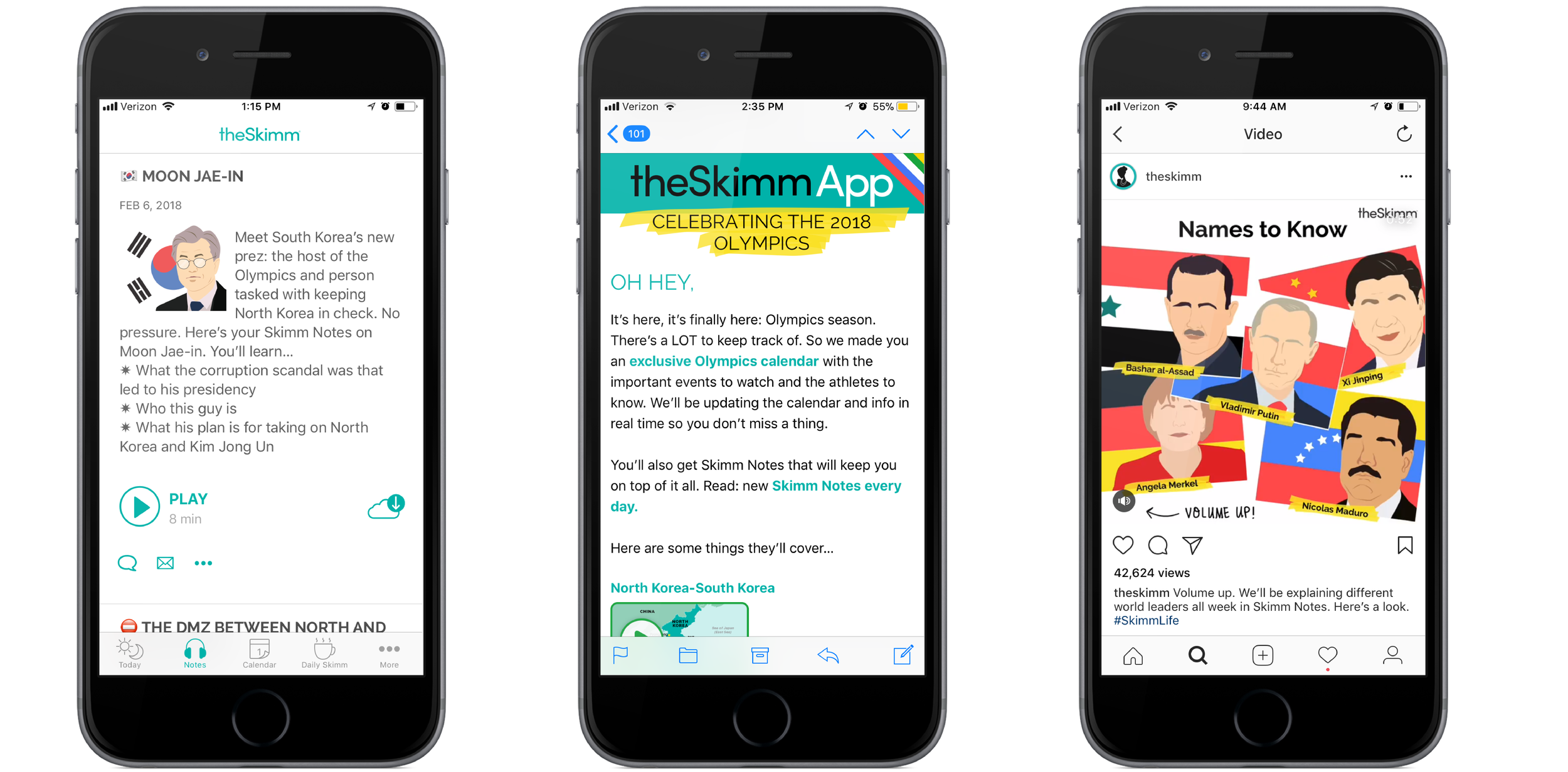
The Skimm
Illustrations
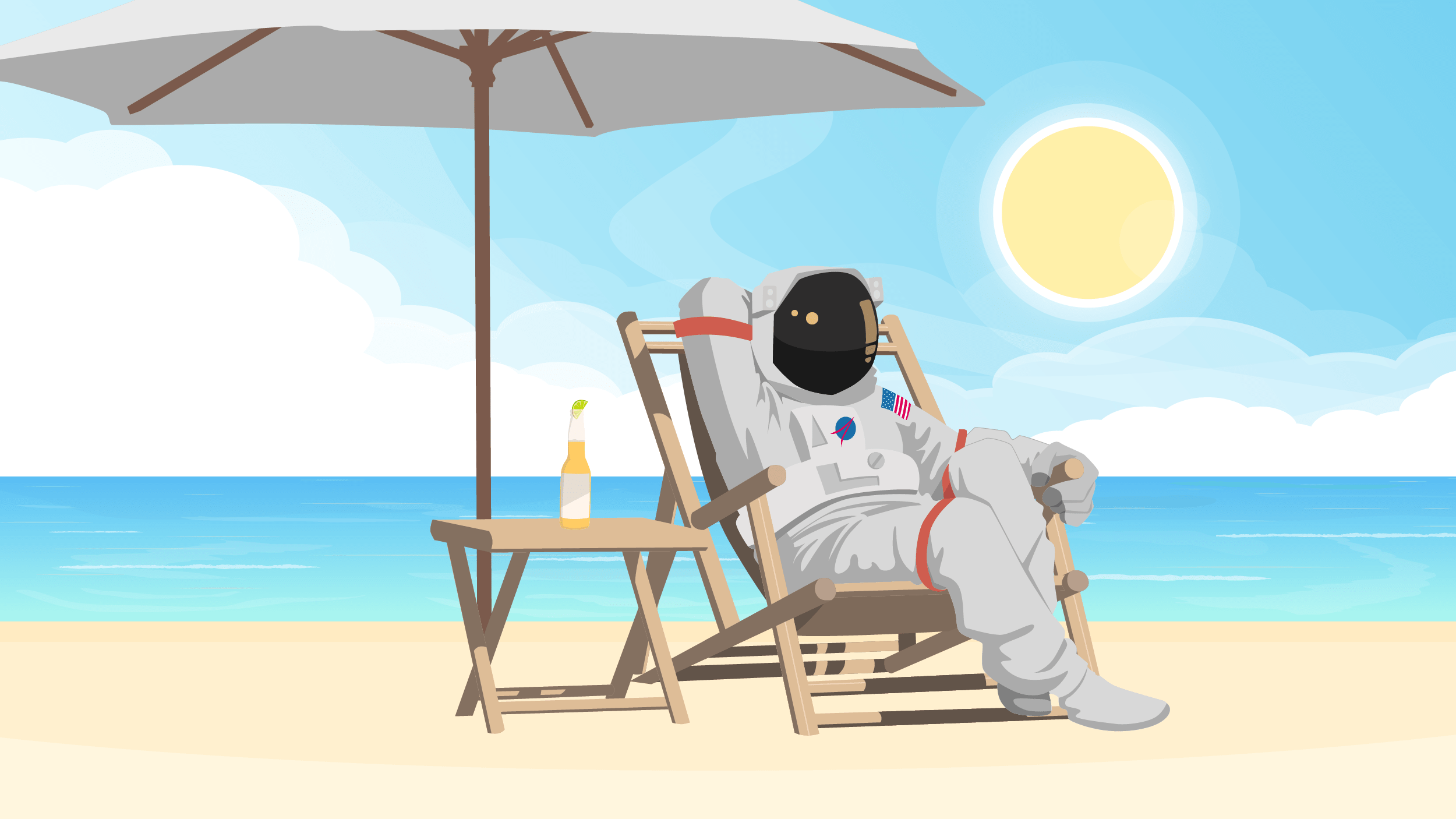
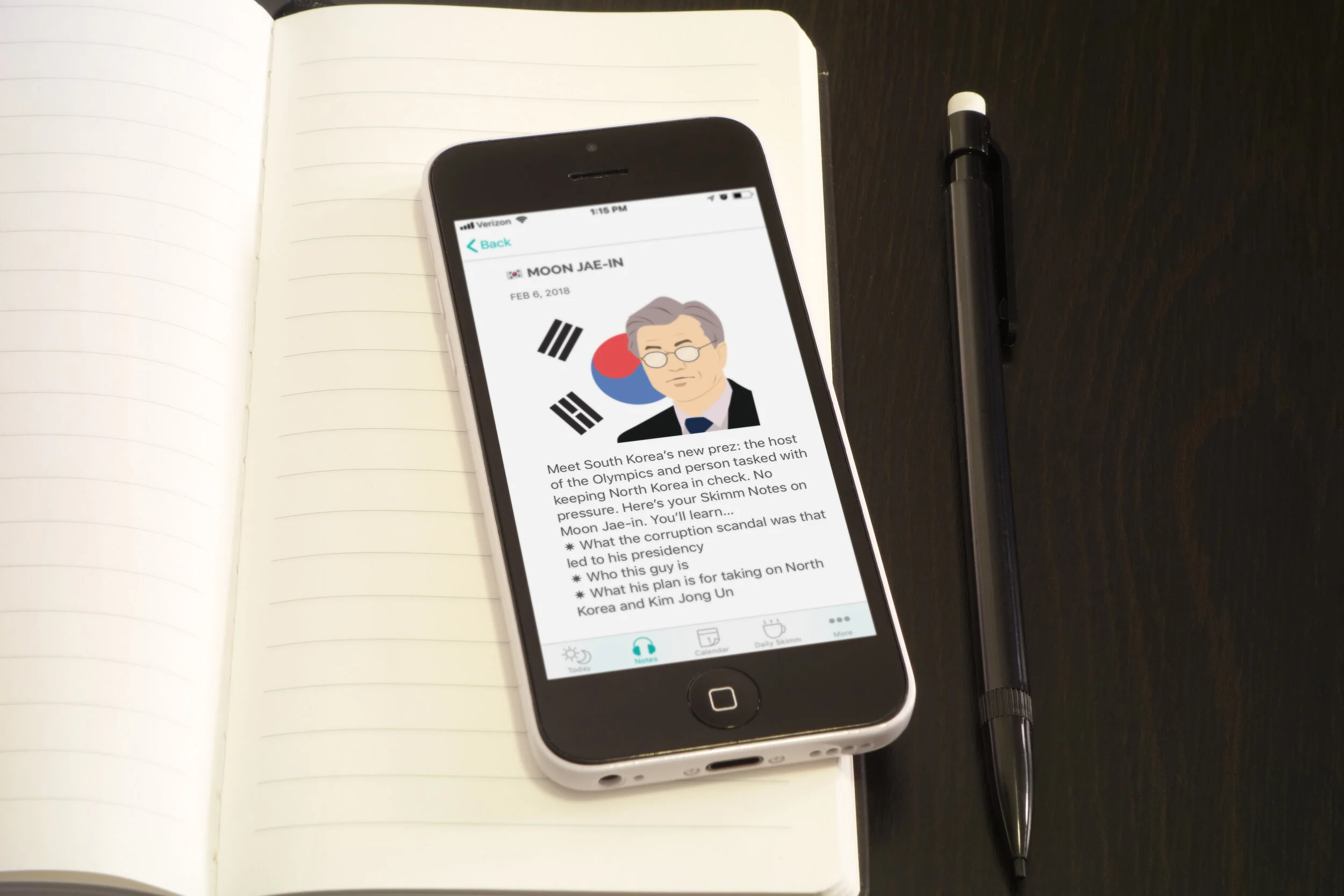
Headline images created for featured articles on the Skimm app, emails, and website.
Step 1: rough thumbnails for concept and composition
Step 2: a more detailed sketch
Step 3: final vector artwork
Venus and Serena Williams
Justice Ruth Bader Ginsburg
Beyonce and Jay-Z
The Skimm Girl mascot
Additionally, there was a separate illustration style for social media posts. This style was meant to feel more hand-drawn rather than professional, and appeared on the Skimm’s Facebook and Instagram.
I created some infographics for the Skimm’s Mental Health Guide. My task was to create four different graphics using a specific set of colors, images, and typography. These graphics were then placed in the guide to illustrate and emphasize important data.
Amplifinity was looking to update their sales presentation. In order to do this, I reviewed the flow of information and constructed a basic narrative:
1. Introduction: We are Amplifinity, and we’re going to use our platform to help you make referrals.
2. Types of Partners: Resell and referral partners are two different types of opportunities, and based on our data we believe you should focus on referral partners.
4. Referral Partner Program: Here is how a referral partner program works, as well as pain points you may encounter.
5. Amplifinity’s Differentiation: Amplifinity’s platform is designed to address those pain points, and will make your sales process more efficient and successful.
6. Conclusion: Amplifinity will increase your sales, here is how to contact us.
With the presentation divided into simpler parts, I moved on to thumbnail sketching, and then wireframing.
Once the content and wireframe layout was finalized, I developed a color scheme and curated a gallery of possible stock images for review. The photos and logo placements were treated according to brand standards, and a new style of icon was developed specifically for this project. Below is the final presentation.
My Last Soundtrack is an incredible start-up company that provides users with a way to tell their life stories while simultaneously offering resources and support to those dealing with loss. With direct feedback from the founders Sue Kemple, Joe Cannon, and Carl Hammerdorfer, I worked to craft a brand that carefully balanced sensitivity and levity. Below you can view the current version of their brand book, and you can also visit their beta website at http://www.mylastsoundtrack.com/


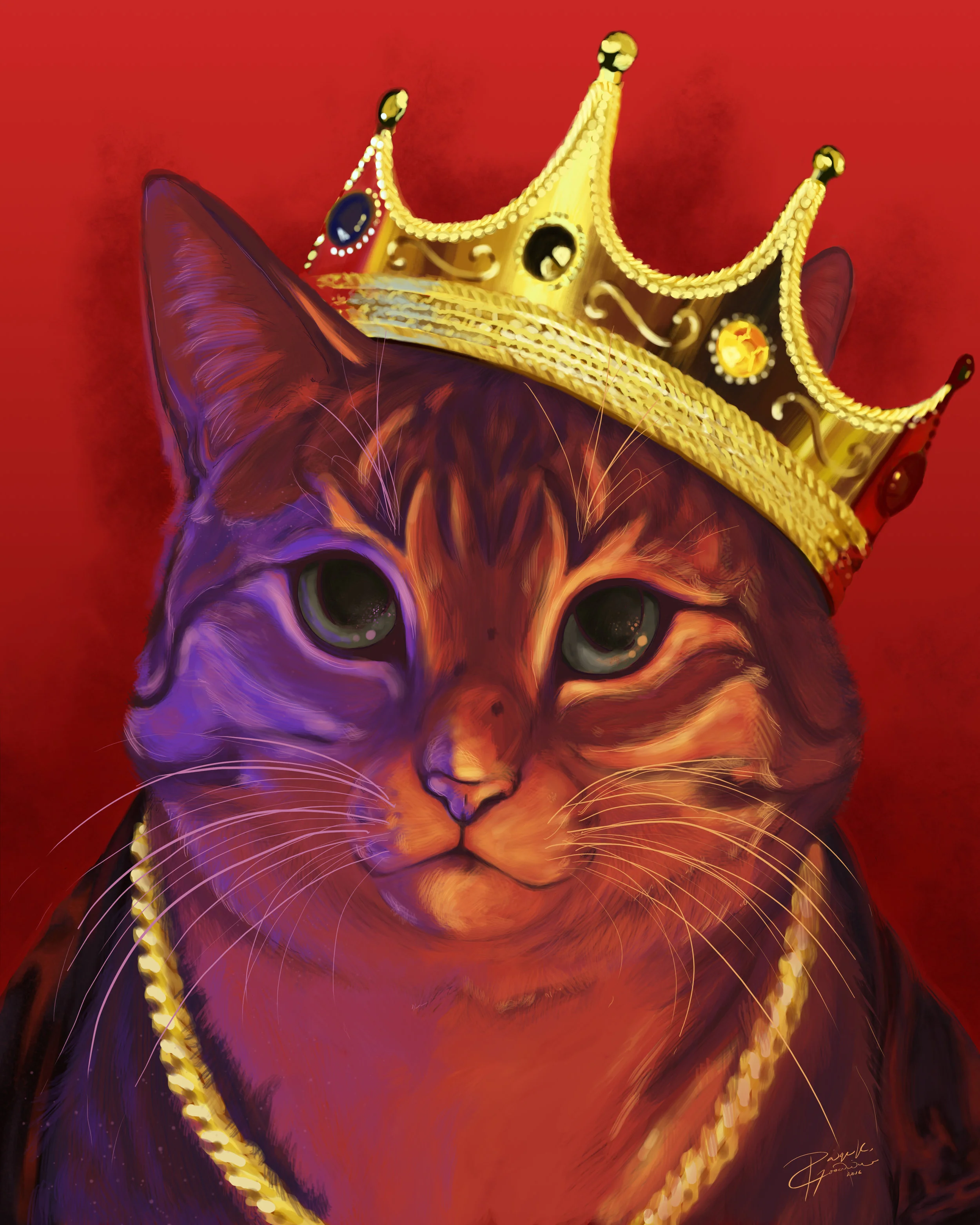
An assortment of art commissions created using CS6.
A pet portrait of a cat named BB, done in the style of an iconic photo of the Notorious B.I.G.
A long-form wall poster commission celebrating the works of Studio Ghibli and Hayao Miyazaki.
A portrait of a close friend, created because she is a wonderful person and I adore her.
A grunge-inspired portrait of Christopher Eccleston in his role as the 9th Doctor from BBC's Doctor Who.
Another grunge-inspired doctor portrait, this time of Neil Patrick Harris in his role as Dr. Horrible in Dr. Horrible's Sing-a-long Blog.
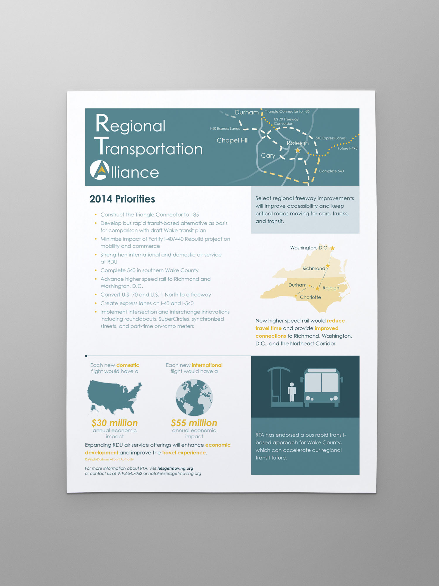
Flyers and brochures for the NC Regional Transportation alliance were re-designed with simple infographics, a limited color scheme, and plenty of white space to improve readability.
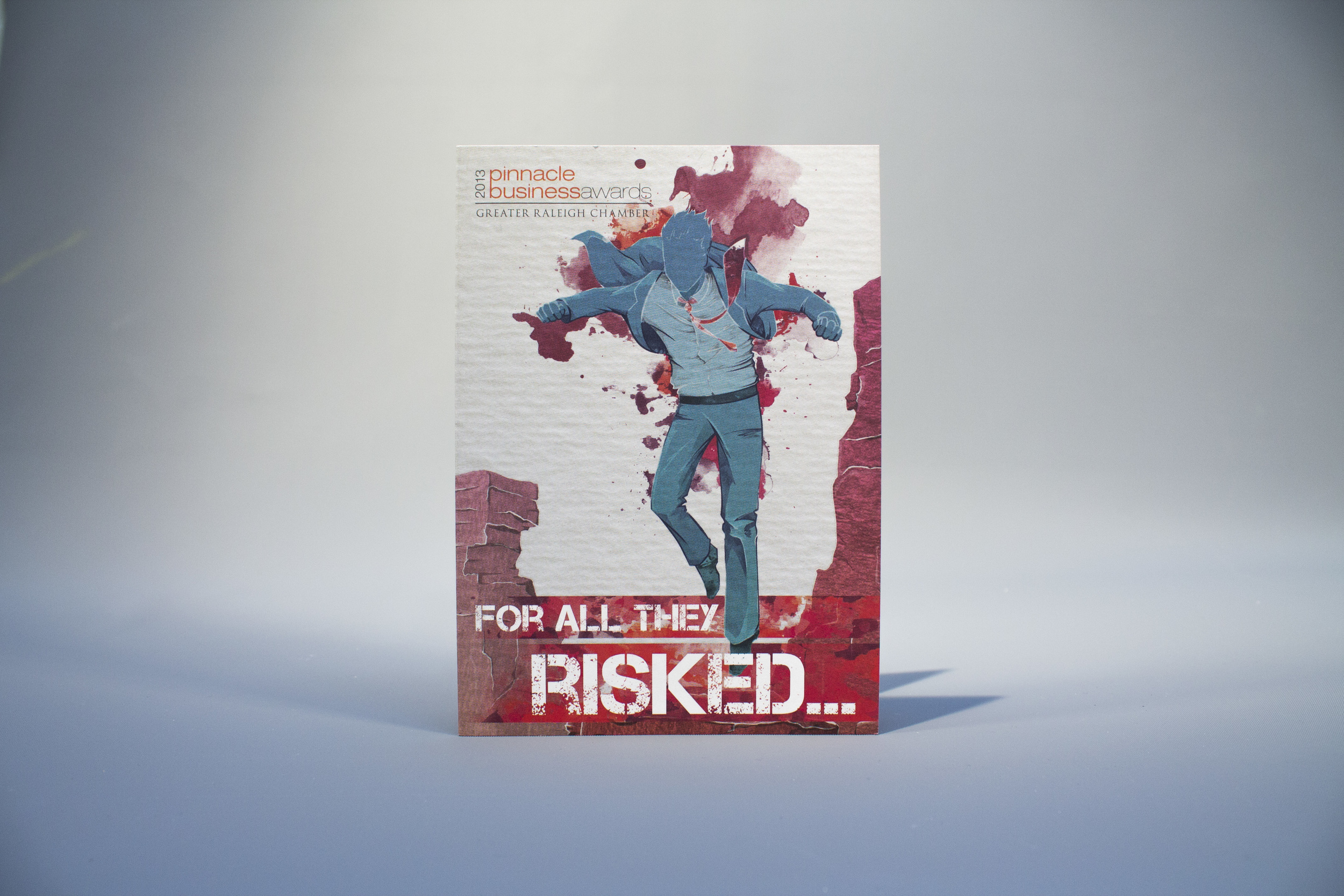
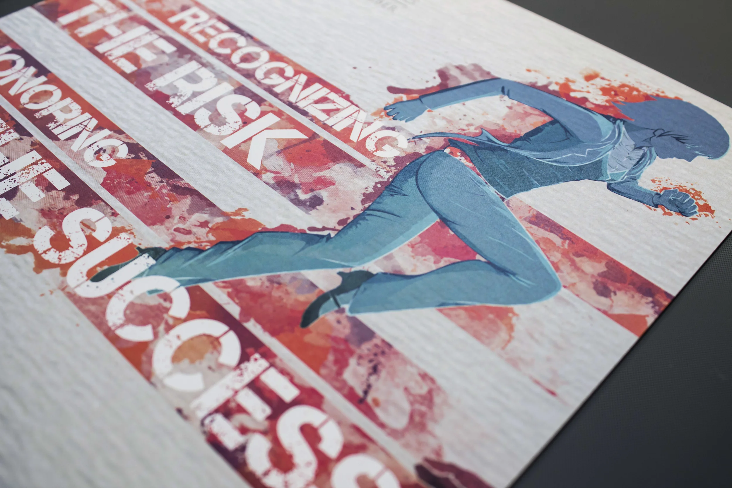
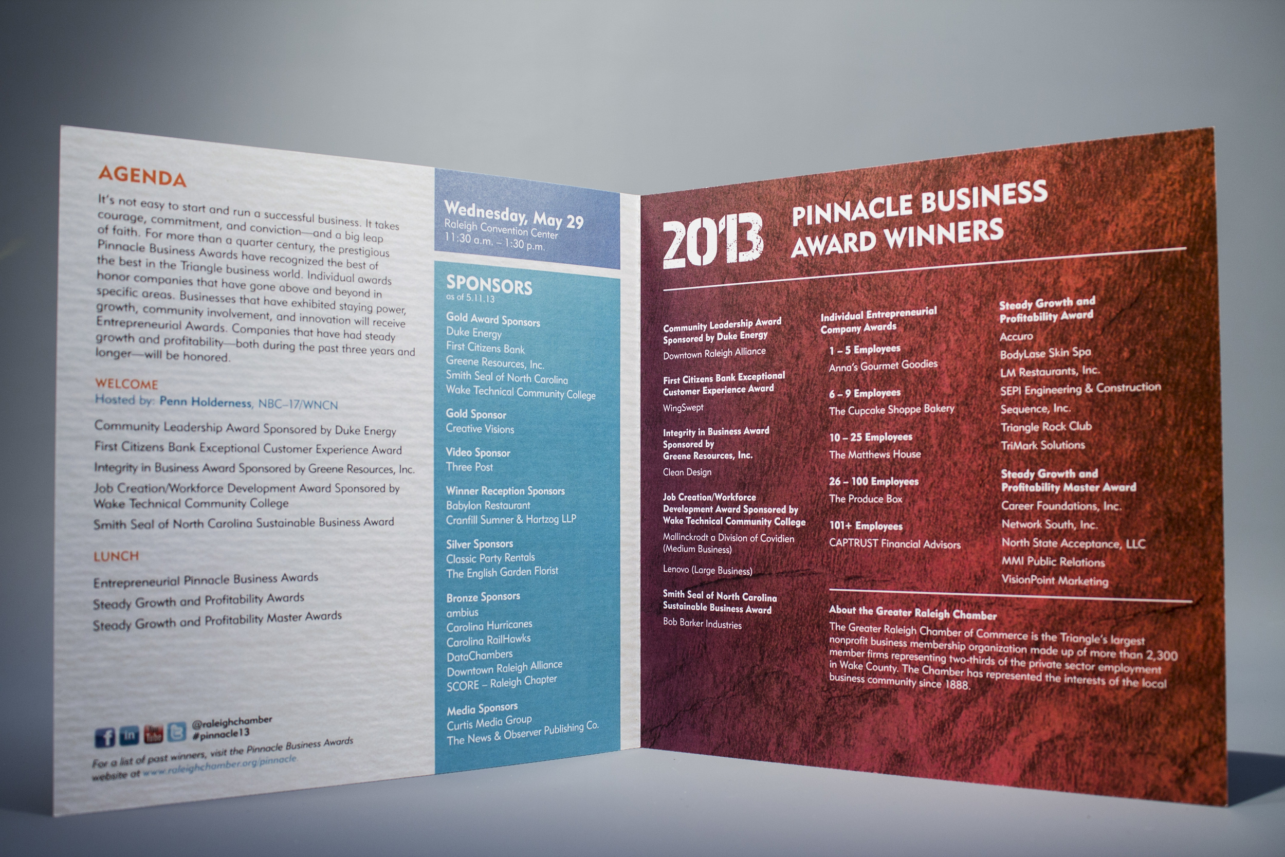
Invitation and program design for an awards ceremony honoring local Greater Raleigh businesses. The original art was created on request and was then incorporated into the overall look of the program. It won the ACCE Award of Excellence for collateral, staging, and use of social media.
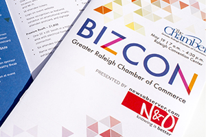
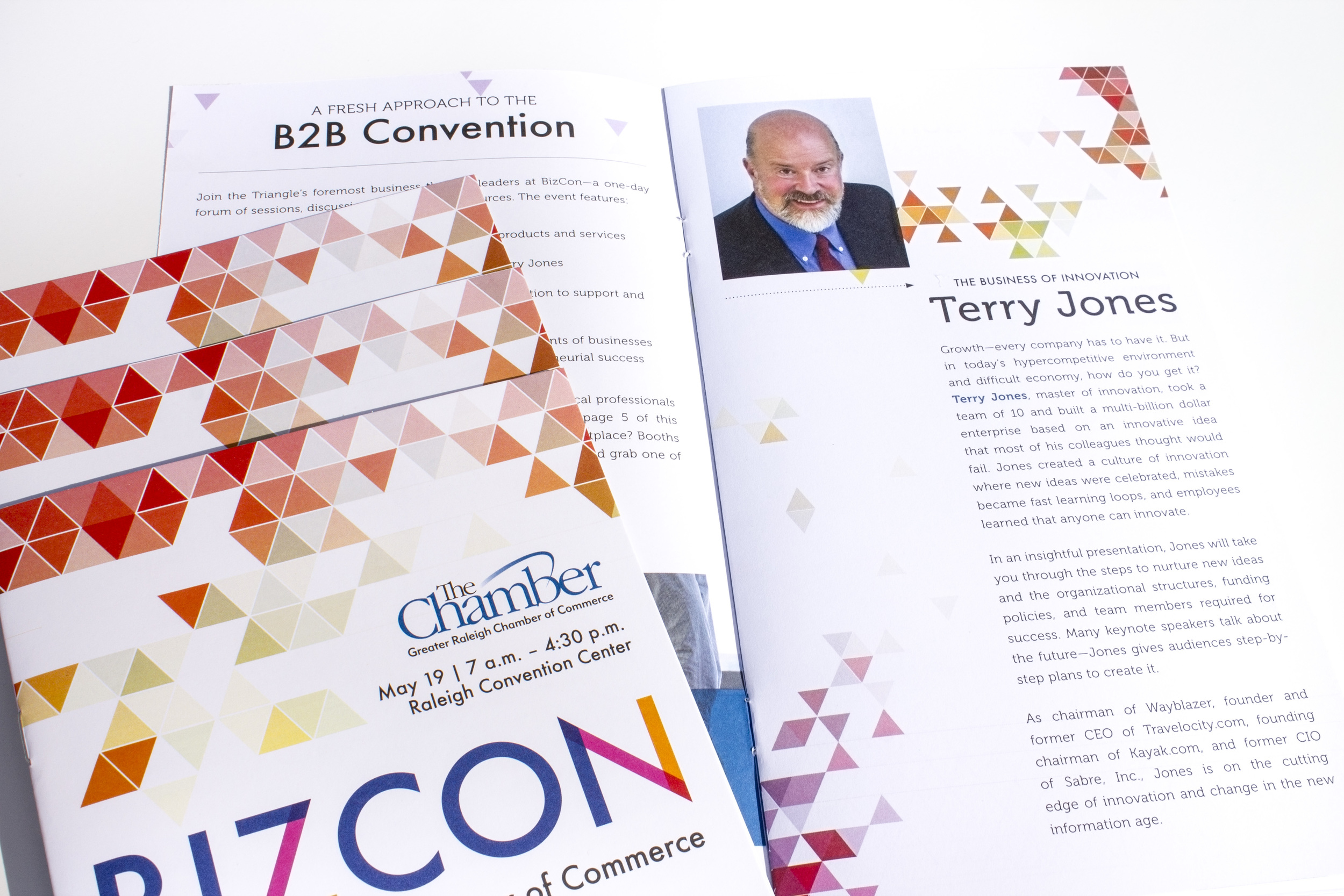
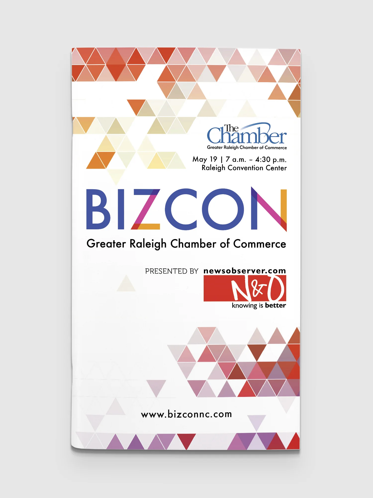
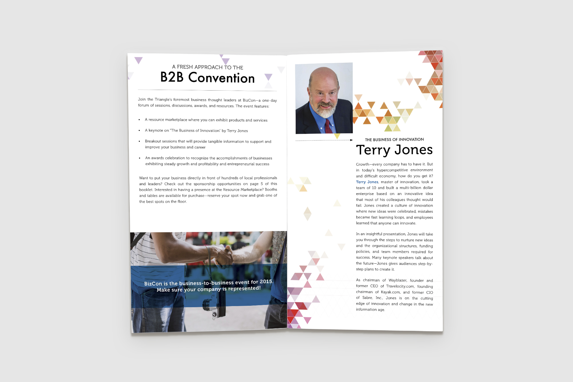
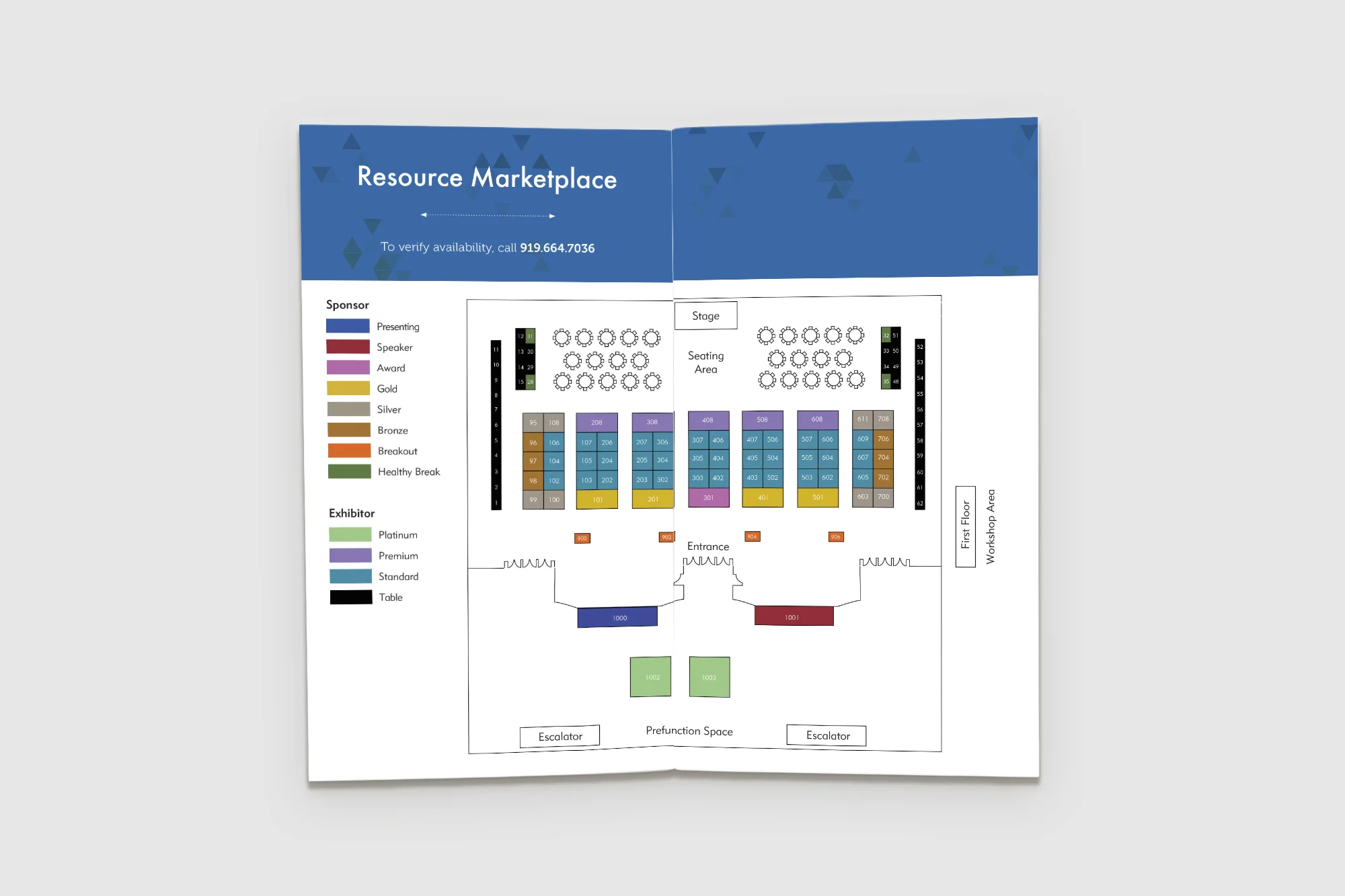
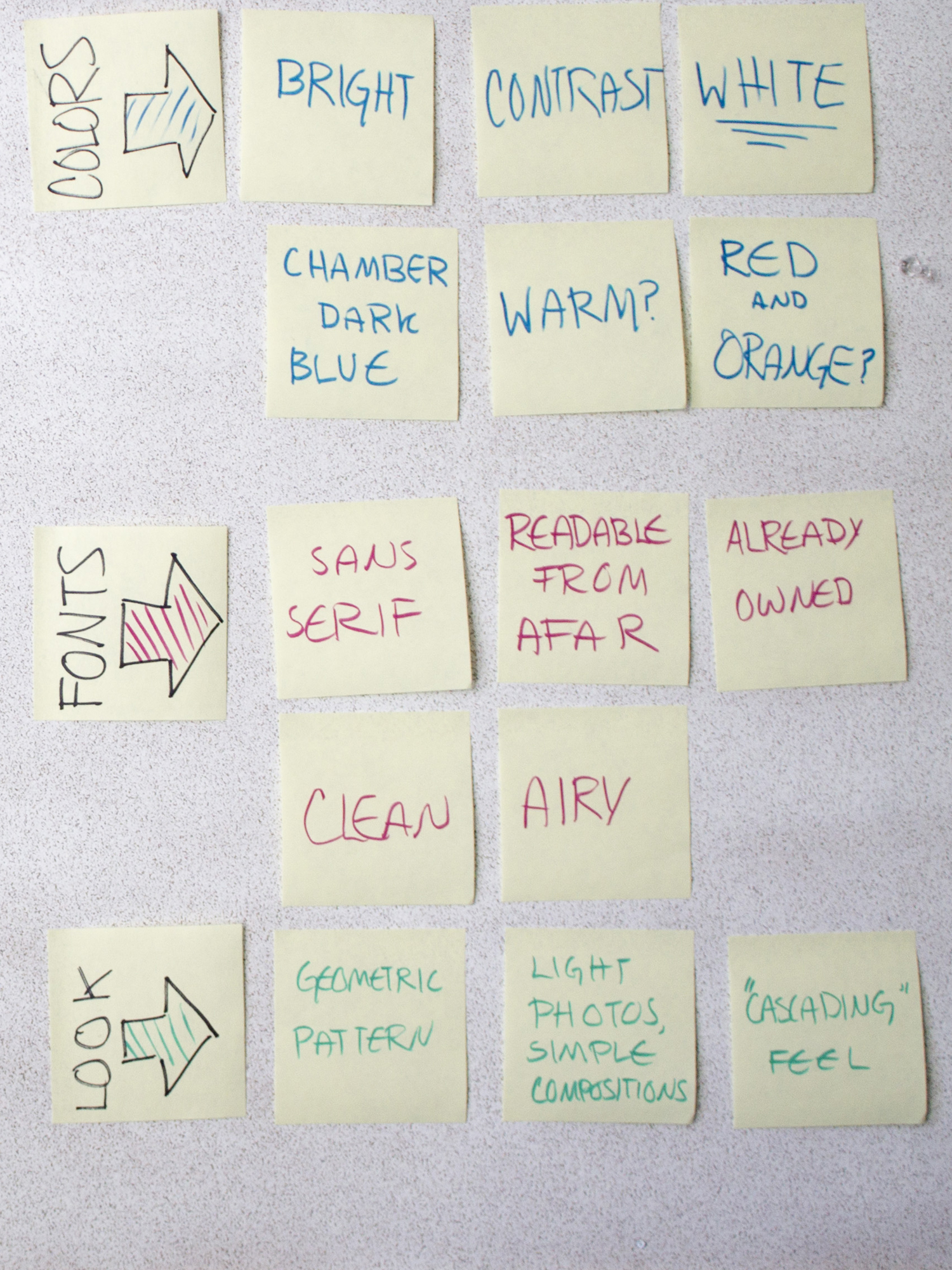
Some examples of the branding, as well as print and digital collateral, created for BIZCON, a 2015 Business Conference.


